8 Years of Design-Led Transformation at Power
A look inside how I helped scale a billion-dollar home remodeling company through UX leadership, systems thinking, and bold product innovation.
A look inside how I helped scale a billion-dollar home remodeling company through UX leadership, systems thinking, and bold product innovation.
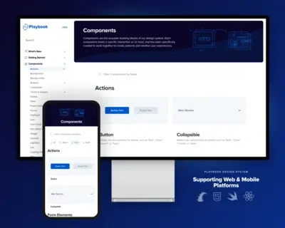
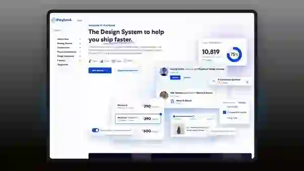
Playbook started as a scrappy style guide and became a multi-language design system powering every PR in Nitro. We went from Bootstrap overrides to a fully responsive system in Rails, React, and Swift—adopted across teams and trusted by engineering.
By pairing live code with Figma kits and prioritizing usability, we shipped faster and more consistently. The system now gets 2M+ downloads a year and supports everything from dashboards to mobile apps to internal tooling.
“Playbook isn't just a system of components.
It's a system of thinking.”
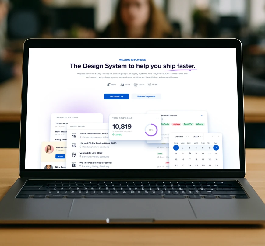
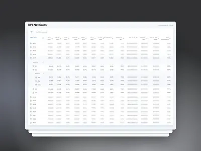
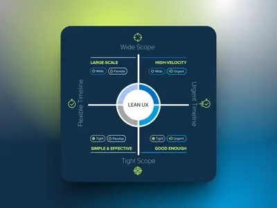
The largest design system ever built for Ruby on Rails.
*Power Stats
Adoption in legacy platform
*Power Stats
Components used across all apps
Downloads
Customizable
Components
Core
Platforms
*Estimates based on stats from main platform ecosystem, Quote based on the number of view components available to the public
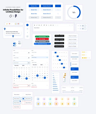
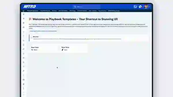
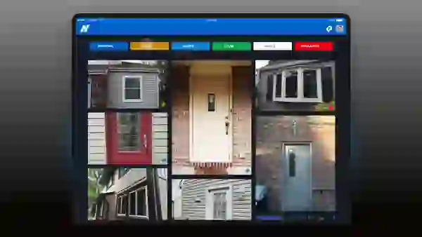
Visual source of truth for designers — every Playbook component, documented and ready to use.
Shared styles and behaviors implemented across Rails, React, Swift, and Figma.
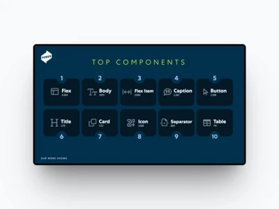
A glance at the most-used Playbook elements across the Nitro platform.
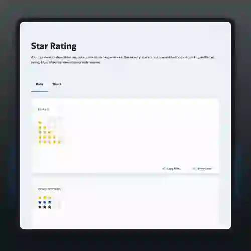
Interactive, accessible UI pattern used in surveys, reviews, and forms.
Live testing environments where devs can explore, tweak, and QA components.
Behind-the-scenes tool to track component usage across apps and teams.
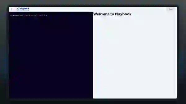
Homepage interface with direct code access — bridging design and engineering.
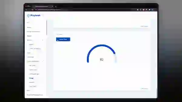
Lightweight data viz component for real-time metrics and status.
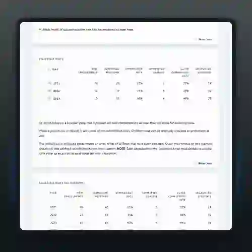
Complex table component supporting expand/collapse, multi-select, and actions.
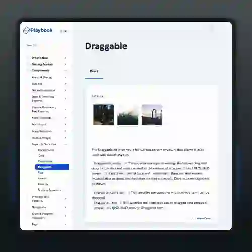
Flexible drag-and-drop pattern powering reordering, sorting, and layout controls.
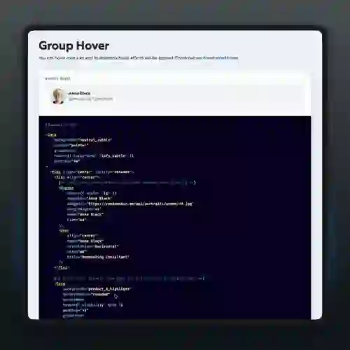
Coordinated hover states for layered interaction design.
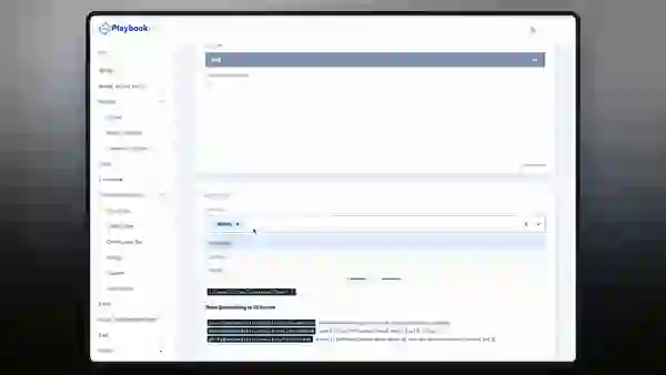
Predictive search and filter component with keyboard support.
Pre-built page-level layouts, helping developers scaffold full views in minutes.
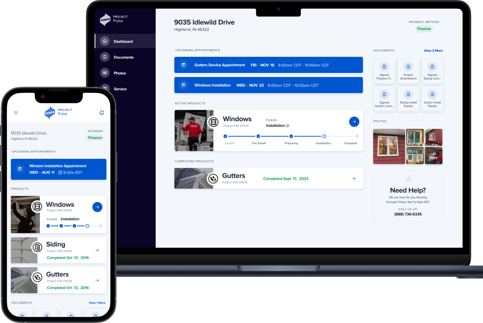
Pulse was our first major consumer-facing product. It started with a vision: make the chaos of home remodeling feel calm. From kickoff to launch, we ran rapid UX research, stripped away complexity, and shipped an experience customers love.
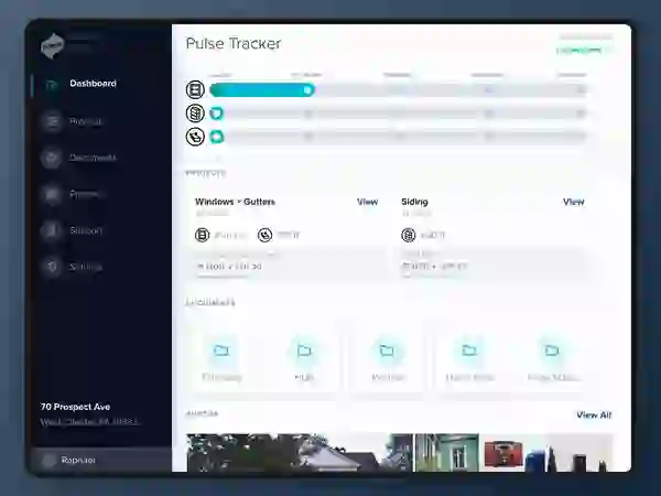
The dashboard became a daily ritual for thousands. With over 567k users and 13k+ deep engagements, Pulse changed how we connected with customers—and proved that internal systems can lead to external delight.
“Pulse didn't just track the project. It gave customers control.”
Since Creation
(Launch - March 2025)
Users in First Month

We started with listening: interviews, surveys, field visits. Users wanted less jargon, more transparency, and fewer surprises. So we mapped every moment of the remodeling journey, designed flows around natural touchpoints, and shipped fast.
The result was a clean, mobile-first dashboard that let users preview doors, confirm details, and feel confident every step of the way. Pulse became a surprise delight in a space where expectations were low.
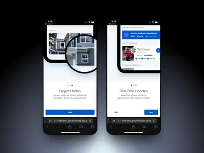
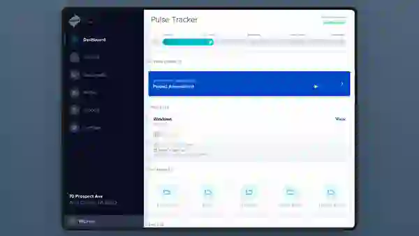
Central hub for every step in the customer journey—simplified and designed for clarity.
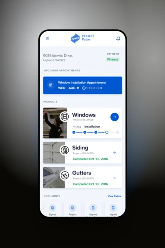
Optimized for access on the go, keeping customers connected from anywhere.
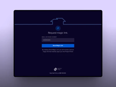
One-tap login with no passwords—reducing friction while boosting trust.
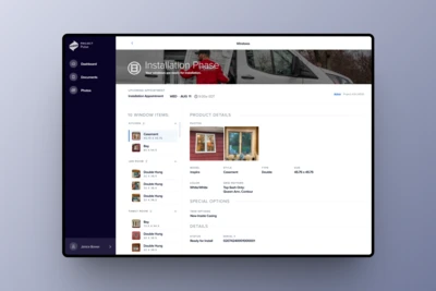
Key info delivered clearly—timeline, milestones, and confirmations in one place.
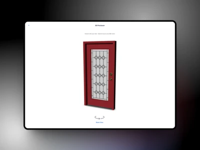
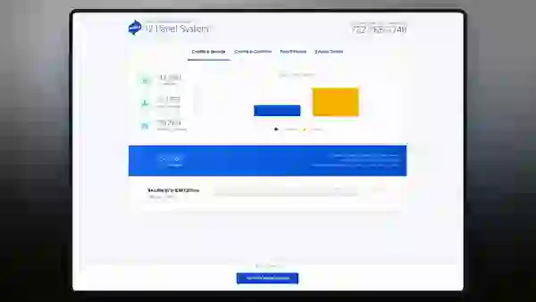
Lets users explore their actual product with an interactive, photorealistic view.
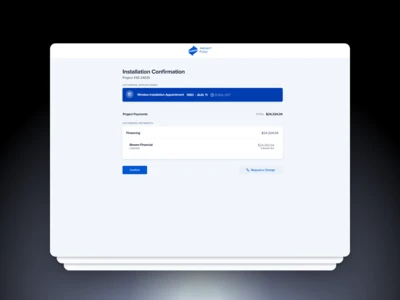
A complex workflow made simple—secure payments handled directly in Pulse.
A guided setup experience that helps homeowners start with confidence.
How user research shaped the dashboard—showing the evolution from clutter to clarity.
An intuitive flow that lets users sign documents with clarity and peace of mind.
From COVID-19 disruptions to 3D visualization breakthroughs, this lab created space to experiment, prototype, and prove what's possible. UX R&D at Power wasn't just an after-hours side hustle — it was a core function of how we planned, pitched, and accelerated the future.
We made room for safe, low-risk exploration inside a mature org. That breathing room enabled some of our most creative outputs: from remote sales tools to internal design knowledge hubs and fully 3D-rendered product configurators.
“Not every idea shipped, but every idea sharpened the team. And many became the future of our platform.”
Innovation Highlights

The innovation lab wasn't just a sandbox — it was a pressure cooker. We took on near-term strategic bets, using design and prototyping to unlock big moves ahead of engineering. It was a place to trial the hard stuff: new platforms, new modalities (like 3D), or tools that didn't have an owner yet.
Virtual Appointments showed how to rethink an in-home model during COVID. Huddle became our design team's source of truth. The 3D Door Builder proved that sales configurators didn't have to feel like a slideshow. All were built with tiny, fast teams — and many went straight to production.
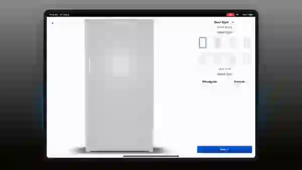
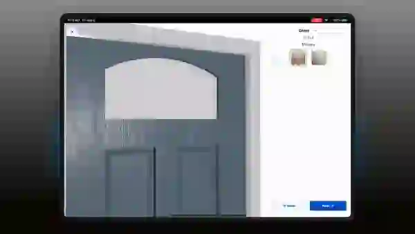
A product configurator with real-time 3D rendering - elevating the buying experience with immersive visualization.
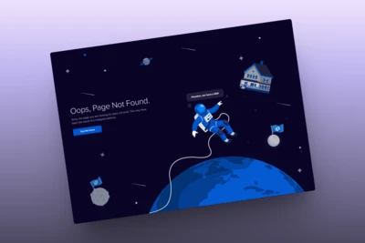
A playful yet purposeful design reflecting Power's brand personality, even in error states.
Updating Nitro branding to match Power's new looking feel.
Early visual storytelling tools used to communicate clean energy offerings to customers.
Built in response to COVID - enabling remote consultations with no loss of trust or clarity.
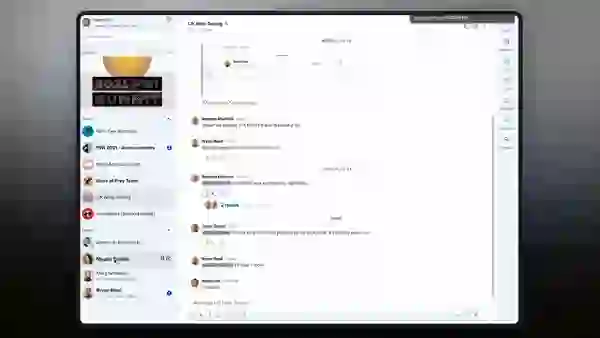
An collaboration tool for real-time sharing across teams and locations. This powers communication for the business.
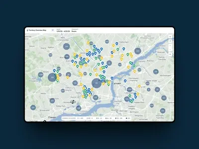
Geospatial tools for optimizing sales and service regions visually, important for opening new offices and locations.
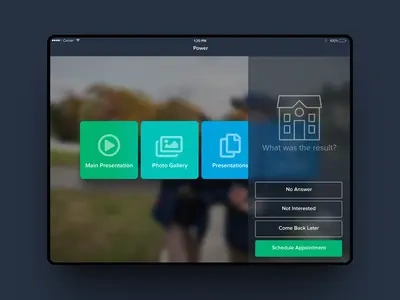
What started as an innovation experiment turned into a full product. Fully interactive product walkthrough - redefining how customers explore options.
Greater control over how you see your chats and conversations.
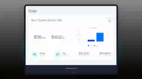
A refined version of the solar presentation, emphasizing speed and polish.
Custom brand assets developed to align internal tools with the Power visual system.
Early UI concept for in field consultants to access nitro and set appointments.
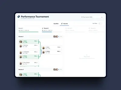
We built a bracket system and playbook and used it all over nitro to Power promotionals.
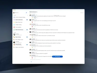
A modern messaging experience integrated into the employee platform.
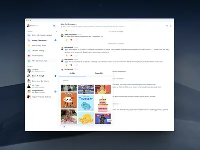
Enhancing the chat experience with animated interactions for personality and engagement.
Not every problem needs a prototype — but our biggest wins all started with one. These were the major product initiatives where UX led the way through ambiguity, validated the path forward, and laid the foundation for game-changing apps.
With Home Tour, we redesigned a critical step in every customer project. With the Inventory Scanner, we connected physical product flow with digital tracking. Each helped set new patterns that influenced Nitro-wide standards.
“We built internal tools at enterprise scale, but with startup speed.”
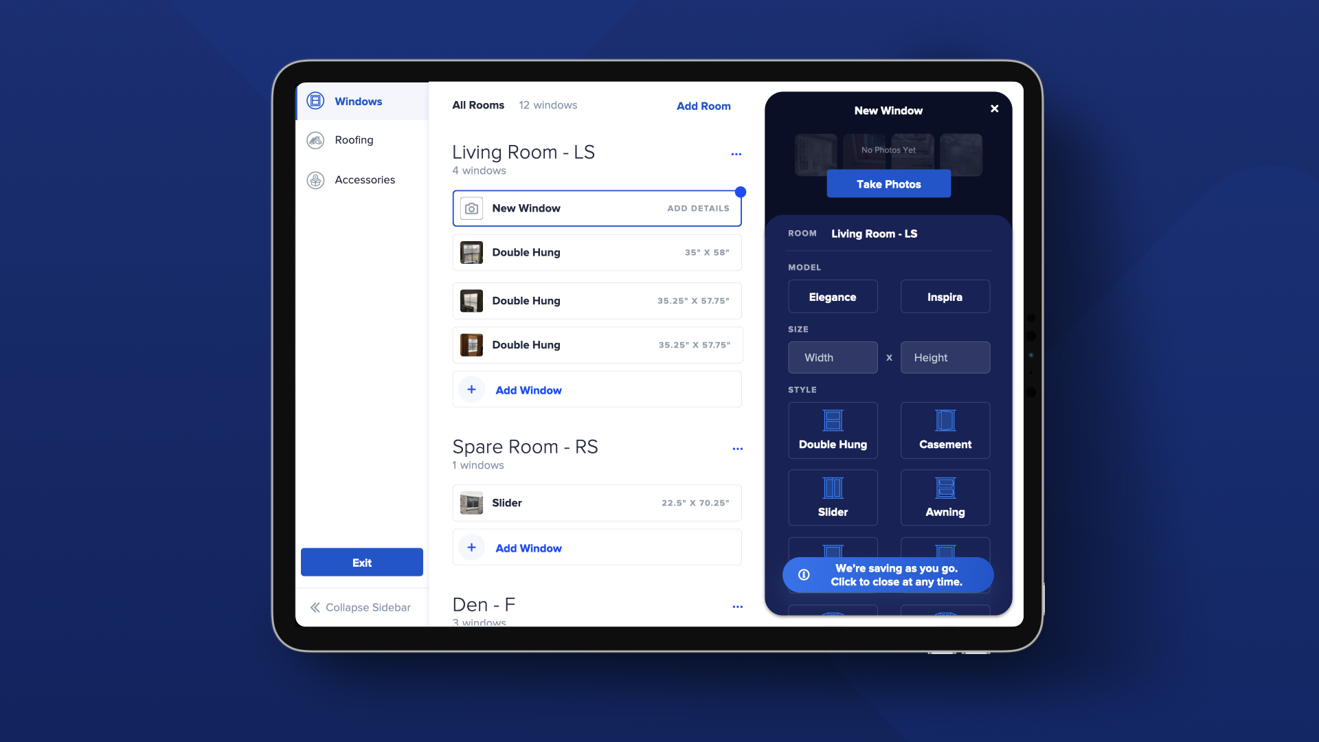
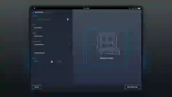
We didn't build these apps in a vacuum. Home Tour took 3 years of research, testing, iteration, and simplification before it launched. It replaced a legacy window-measuring tool and is now used on every project. The design helped frame everything: from how to capture data to how to structure handoffs to engineering.
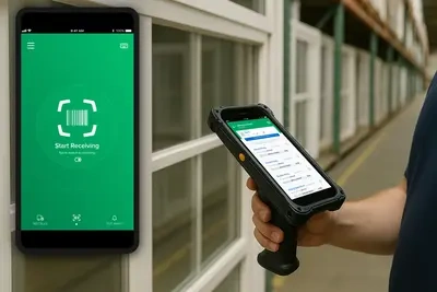
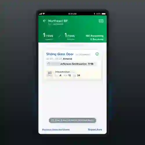
The Inventory Scanner combined hardware and software in a tight loop. It allowed us to manage the full warehouse lifecycle of window products—from truck delivery to bay placement. And its UI design was so modern and usable, it influenced other Nitro interfaces for years to come.
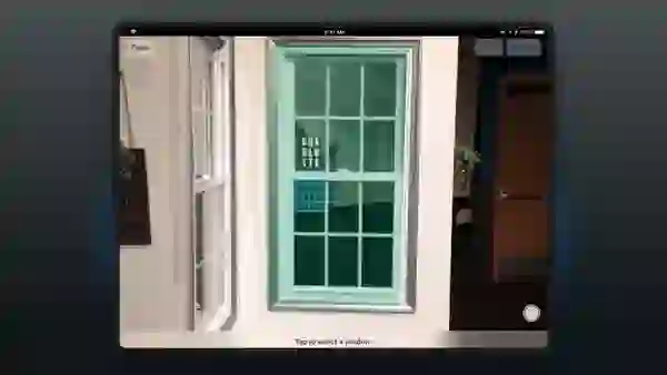
A reimagined, touch-free way to measure a window - precise, fast, and intuitive. This was an innovation project that turned into real tech.
Warehouse management
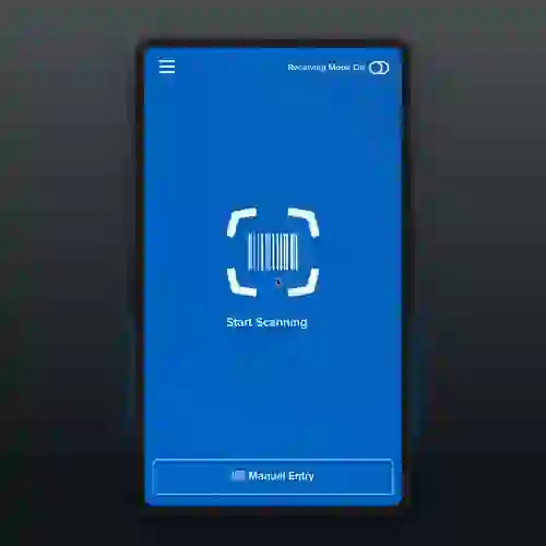
Simplified warehouse receiving workflows with a sleek scanner interface for inventory accuracy.
One of the earliest vision prototypes that shaped Home Tour's success.
Fast, gesture-driven UI for a more responsive app.
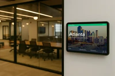
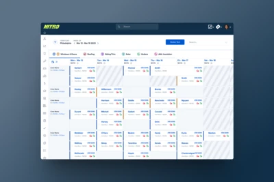
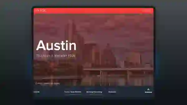
Tap-to-book meeting rooms using smart scheduling from any device.
Find and conference rooms and spaces instantly with an elegant, responsive UI.
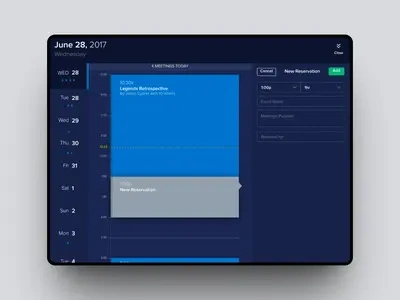
A mobile-first experience for managing meeting room reservations on the go.
A tap-to-browse gallery showing real past projects—used by reps to build trust and showcase craftsmanship.
Streamlined employee onboarding - engaging and secure.
Company-wide training tool with easy navigation, rich content, and clear tracking.
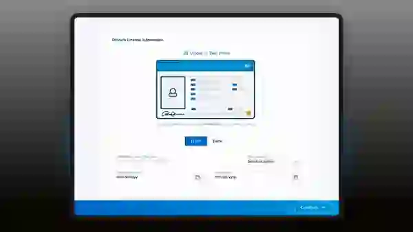
Upload, manage, and validate hiring documents with streamlined flows.
Bespoke icons created to support Playbook and elevate product interfaces.
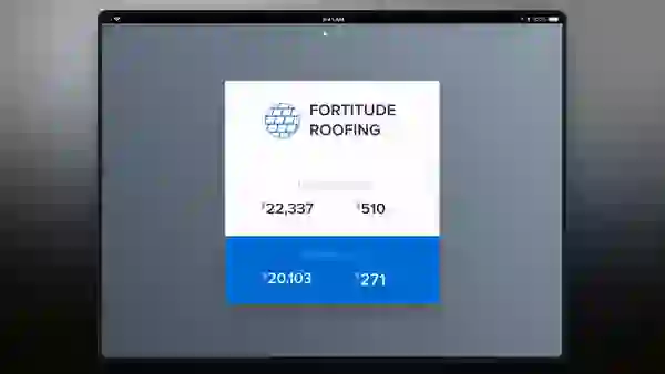
Track performance across teams and platforms in real-time.
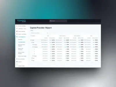
Streamlined loan processing for Stream Innovations.
Financial operations simplified through design-forward tooling.
We built our own app to run our agile sprints. Update rows at once with ease and validation control.
A real-world demo of Home Tour's AR-powered field measurements.
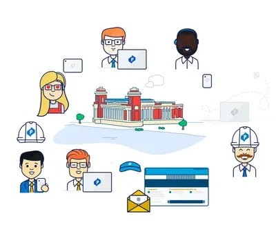
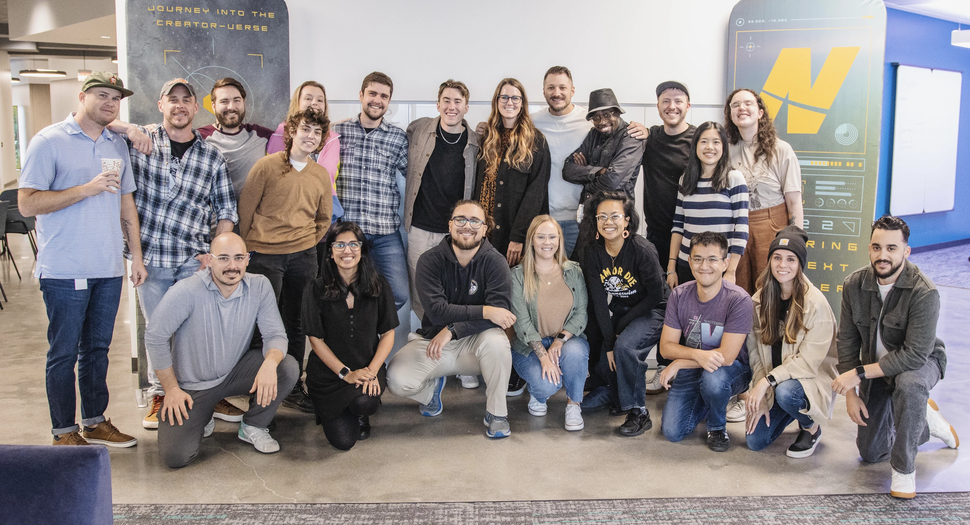
From a team of one to a department embedded in every corner of the company, building UX at Power was a lesson in scale, culture, and momentum. We didn't just grow fast—we grew right. With intentional recruiting, clear career paths, and a strong leadership bench, we transformed UX from a support role into a strategic driver.
Our culture became our product: daily stand-ups, dual-track agile rituals, onboarding that empowered, and systems that sustained. What started as a whisper of "design" became a drumbeat across every team in the company.
“We didn't just bring in designers—we built an environment where design could thrive.”
A strong team is more than headcount. It's habits. We built a culture of trust, transparency, and speed. Daily UX standups gave us shared momentum. Our onboarding playbook meant every new hire could ship confidently within weeks. And with dual-track agile, we built the right thing—not just the thing that was spec'd.
Retention soared. Designers stayed not just because of the work, but because of the environment. UX became a sought-after discipline across the company, influencing hiring, engineering, and even how product was scoped.
Tools that empowered designers to annotate, organize, and hand off confidently.
A visual map of how we aligned problem solving, delivery, and research.
Showcasing how our team broke big challenges into fast, collaborative loops.
More than design assets—icons built team identity and reinforced shared systems.
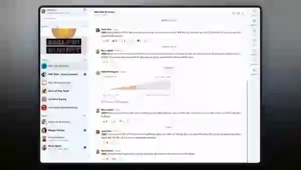
A homegrown tool that made sharing work with engineers seamless and fast.
Interactive specs embedded directly into workflows using Huddle.
Our UX playbook visualized: mapping journeys to improve outcomes.
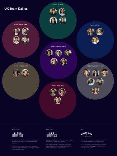
Daily rituals that gave us clarity, speed, and team-wide visibility.

Rituals and routines that turned teammates into creative collaborators.
Research built into our rhythm—guiding every sprint with insight.
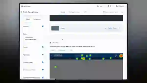
Lightweight tests that led to heavyweight wins—validating early, often.